A Chart Turns Values Into a Visual Comparison
A chart represents data graphically.
It can make some patterns easier to notice than they are in a large table.
For example, a PivotTable might show:
A chart can turn those counts into visible differences in length or height.
The data has not changed.
The representation has.
Begin With a Question
Before selecting a chart, identify what you want the viewer to notice.
For example:
A bar or column chart can make category counts easy to compare.
The chart type should support the question.
Do not choose a chart only because it looks interesting.
Use the Summary Rather Than Every Raw Record When Appropriate
If the goal is to compare song count by Genre, a summary table is a natural chart source.
Conceptually:
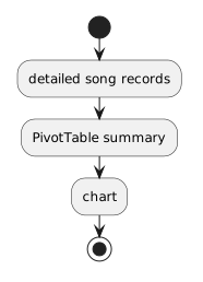 DetailedSongRecords.
The chart visualizes the grouped result.
It does not need one bar for every individual song.
Categories and Measures Have Different Roles
For:
Genre provides the categories.
Song Count provides the numeric measure.
A chart needs both roles to be understandable.
If the axes or categories are reversed accidentally, the chart may become difficult to interpret.
Give the Chart a Useful Title
A title such as:
does not explain the purpose.
A stronger title is:
The viewer should understand the subject of the visualization without needing to inspect the spreadsheet setup.
Labels Should Communicate Meaning
If a horizontal axis contains genres, the viewer should be able to identify the category names.
If a vertical axis represents song count, the measure should be understandable.
A chart is a communication artifact.
Labels are part of that communication.
Avoid Decorative Complexity
A chart does not become more informative because it uses:
- unnecessary 3D effects;
- excessive labels;
- many decorative elements;
- confusing shapes.
The visual form should make the comparison easier to understand.
Simple charts are often more effective.
Do Not Let Color Carry the Only Meaning
Color can help distinguish categories.
The categories should still be understandable from labels, ordering, or other visible structure.
A viewer should not need perfect color perception to determine what the chart means.
Changing the Measure Changes the Story
Suppose the same dataset has a Rating field.
One chart might show:
Another might show:
Those charts answer different questions.
Even if they use the same categories, the numeric measure changes the interpretation.
This is why the assessment asks for a different measure or grouping from a demonstration rather than merely reproducing the same chart.
A Chart Can Be Technically Correct but Misleading
Suppose one chart starts its numeric axis near the highest value instead of at a natural comparison baseline.
Small differences may appear visually dramatic.
Or suppose the categories are sorted in a way that hides an obvious pattern.
Technical tools do not guarantee fair communication.
The person creating the chart must consider whether the visual representation supports an accurate interpretation.
Read the Chart Back Into Words
After creating a chart, explain one thing it reveals.
For example:
or:
The statement should be supported by the chart.
Do not make a claim the visualization does not show.
The next Learning Activity focuses on what a visualization can—and cannot—help you conclude.