A large table contains detail.
A visualization can make selected patterns easier to see.
Charts are especially useful for noticing:
The chart is not creating those patterns.
It is changing how the data is represented.
Suppose a table shows:
| Genre | Song Count |
|---|---|
| Jazz | 12 |
| Pop | 19 |
| Rock | 28 |
The table makes exact values easy to read.
A bar chart of the same values makes the relative difference between the categories easier to see quickly.
Use the representation that supports the question.
A chart does not show “the whole truth about the dataset.”
It shows the fields, filters, groups, and calculations chosen for that visualization.
For example:
Song count by Genre
does not tell you:
The chart answers a selected question.
Suppose the source table is filtered to:
Year = 2024
and then a chart is created.
The chart represents the filtered 2024 records, not necessarily the full dataset.
A viewer needs enough context to understand the scope.
Always notice whether filters or other selections affect the source.
A PivotTable may turn 500 song records into:
5 genre totals
That is useful for comparison.
It also removes individual-record detail.
If you need to know why one genre total is high, you may need to return to the underlying records.
Summary and detail support different questions.
Imagine a chart shows that songs in one genre have higher average ratings.
The chart supports:
This genre has a higher average rating in this dataset.
It does not automatically prove:
The genre causes people to give higher ratings.
The visualization shows a pattern.
Explaining the cause requires additional evidence.
This is an important habit in data interpretation.
Charts can also expose inconsistencies.
Suppose a Genre chart contains separate categories:
Rock
rock
ROCK
The visualization makes a cleaning problem visible.
An unexpected category may be evidence that the source data needs review.
Visualization is therefore useful not only for communicating conclusions but also for inspecting data quality.
A chart may make one difference visually obvious.
The importance of that difference still depends on the question.
For example, the largest genre by song count may be irrelevant if the real question concerns average rating.
Interpret the chart in relation to the purpose of the analysis.
Weak observation:
The chart is interesting.
Stronger observation:
Rock has more song records than Jazz in the current dataset.
Another strong observation:
The 2024 records contain a larger share of Pop songs than the earlier years shown.
The observation names a pattern that can be traced back to the visualization.
If the source contains duplicates or inconsistent categories, the chart reflects those problems.
A polished chart can still communicate a misleading result if the underlying records are wrong.
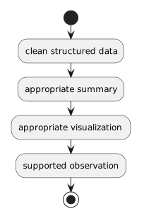
The analysis path is:
clean structured data
↓
appropriate summary
↓
appropriate visualization
↓
supported observation
Every stage matters.
When viewing or creating a chart, ask:
What is easier to notice here than it was in the original rows?
Then ask:
Does the data actually support that observation?
That combination turns a chart from decoration into evidence.