Acceptance criteria
- GetControlDescription uses the configured description and falls back to the member name.
- GetControlType returns the configured type or None.
- HasControl identifies members carrying the control attribute.
11.3 Assignment
Dynamic UI Generation
Work through the stories in order. Use the acceptance criteria to check each feature, and complete the nested tasks using the specified names, values, and scenarios.
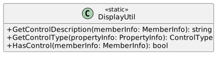
Call the ReflectionUtil's GetAttributePropertyValueAsString and get the Description property from the EntityControlAttribute on the passed in memberInfo. Store the result in a variable named result.
Call the ReflectionUtil's GetAttributePropertyValue and get the ControlType property from the EntityControlAttribute on the passed in propertyInfo. Store the result in a variable.
If the result of the call to GetAttributePropertyValue is not null, cast the result as ControlType and store it in the controlType variable.
The EntityView will be a user control which is a reusable wpf element. You can place this element and reuse it like you would a button or a listbox. You will put the code that dynamically generates UI for an object in this user control.
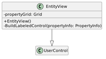
BuildLabeledControl takes a propertyInfo object and creates a control for the property based on the ControlType of its EntityControlAttribute.
Width = 270 Height = 23 Margin = new Thickness(0, 0, 15, 5)
Define and instantiate two ColumnDefinition objects. Assign the Width of the first one to new GridLength(120) and the Width of the second one to new GridLength(150).
Write cases for each of the ControlTypes in the ControlType enum.
For ControlType.None and the default case do nothing and break.
For each of the other cases, instantiate a new type of each of the corresponding control. Call Grid.SetColumn passing in the control and 2. Then, add the control to the grid variable's Children.
case ControlType.TextBox:
TextBox textBox = new TextBox();
Grid.SetColumn(textBox, 2);
grid.Children.Add(textBox);
break;
For the ComboBox control, after instantiating a new combo box, assign the combo box's ItemsSource to a call to Enum.GetValues and pass in the propertyInfo's PropertyType.
For the Label control, use a TextBox for the control. Set its IsEnabled to false.
Define and instantiate a variable of type Label. Assign its content to a call to DisplayUtil's GetControlDescription. Pass int he propertyInfo.
In the EntityView's xaml, click on the UserControl to see its properties. In the event handlers section, double click the box next to the Loaded event to add an event handler.
PropertyInfo[] properties = this.DataContext.GetType().GetProperties();Check if the property has a control by calling DisplayUtil's HasControl. If it does, call BuildLabeledControl and pass in the property.
Add a parameter of type object to the EntityWindow's constructor. In the constructor, assign the window's DataContext to the passed in object after initializing the component.
<local:EntityView Height="225" Width="400"/>
Add a combo box named productComboBox and button named viewProductButton to the MainWindow. Add an event handler for the viewProductButton's click event.
In the Window_Loaded event handler, remove all the existing code. Add code that will populate the productComboBox's items with the different types of products.
Pick one of the types from the combo box and click on the view product button. A new window should pop up with neatly lined up controls for each of the selected product's properties.
Return to each story and verify its acceptance criteria. Preserve the submission format and destination stated in the activity; a reading, setup guide, lab, video demonstration, and oral final may require different evidence.
Interpret display metadata Generate labeled controls for product properties Open a selected product in its generated editor